click on the links on the left to see what is wrong with the world map we all know.
eg.
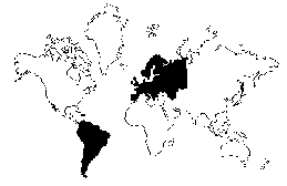
The Greenland Problem " />
The Mercator projection creates increasing distortions of size as you move away from the equator. As you get closer to the poles the distortion becomes severe. Cartographers refer to the inability to compare size on a Mercator projection as "the Greenland Problem." Greenland appears to be the same size as Africa, yet Africa's land mass is actually fourteen times larger (see figure below right). Because the Mercator distorts size so much at the poles it is common to crop Antarctica off the map. This practice results in the Northern Hemisphere appearing much larger than it really is. Typically, the cropping technique results in a map showing the equator about 60% of the way down the map, diminishing the size and importance of the developing countries.
Greenland: 0.8 million sq. miles Africa: 11.6 million sq. miles
This was convenient, psychologically and practically, through the eras of colonial domination when most of the world powers were European. It suited them to maintain an image of the world with Europe at the center and looking much larger than it really was. Was this conscious or deliberate? Probably not, as most map users probably never realized the Eurocentric bias inherent in their world view. When there are so many other projections to chose from, why is it that today the Mercator projection is still such a widely recognized image used to represent the globe? The answer may be simply convention or habit. The inertia of habit is a powerful force.
Last edited by Admin on Fri May 15, 2015 2:30 pm; edited 4 times in total
admin Admin
Posts : 5879 Join date : 2008-11-28
Subject: Re: Real world map Sun Aug 18, 2013 9:11 am


 Thu Aug 15, 2013 2:53 pm